SICK OF IT // SKY
Sick of It is a dark comedy following Karl, a disillusioned London cab driver trying to get his life back on track, accompanied by the relentlessly critical voice inside his head, an outspoken alter ego who looks exactly like him.
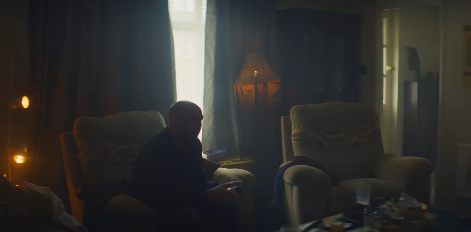
Working with Production Designer Charlotte Pearson, we developed a heightened version of everyday London: familiar, slightly worn and deliberately mundane, but with a strong visual identity running beneath it. A restricted palette of murky greens, ochre yellows and tobacco tones grounded the world, punctuated by brighter oranges and pinks during some of the series' warmer and more tender moments.
As Set Decorator across both series, I particularly enjoyed having the opportunity to return to a world we had established and develop it further. The foundations laid in Series 1 gave us a visual language to build upon in Series 2, allowing environments and characters to evolve without losing the familiarity that was fundamental to the show.
Nostalgic references to mid-century interiors ran throughout the Set Decoration, with warm oak, cork tiles, patterned surfaces, vinyl seating and richly textured fabrics. These weren't intended to make the world feel overtly retro. Instead, they helped create a London that felt accumulated and recognisable, where interiors had been lived in, adapted and rarely started again from scratch.
That sense of familiarity was important to Karl's world. The sets needed to feel ordinary enough to belong to the everyday life he finds so frustrating, while remaining visually heightened enough to support the strange intimacy of watching him argue with himself.
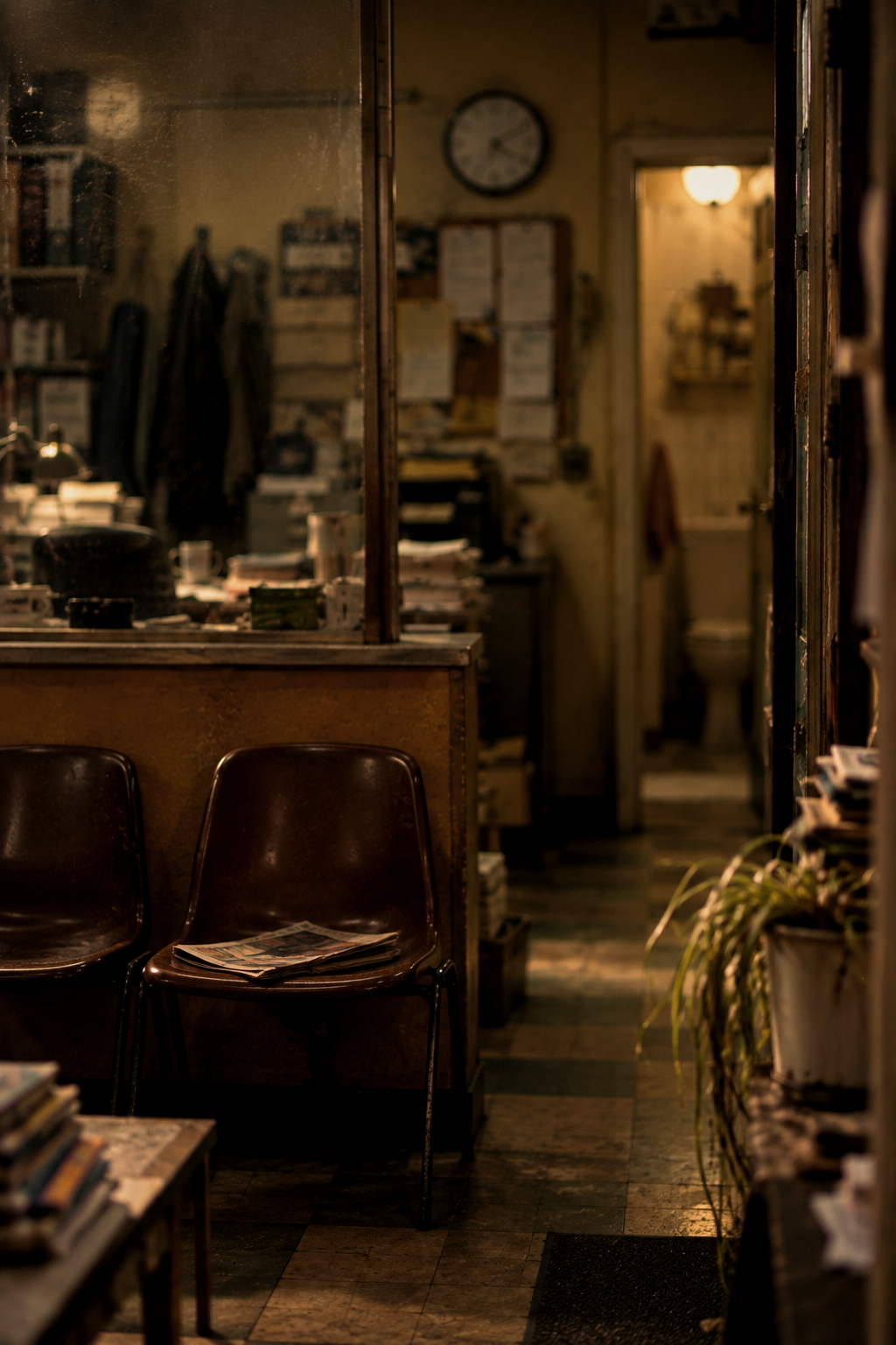
HEIGHTENING THE GRIT, TEXTURE AND MUNDANITY OF EVERYDAY LONDON.
Murky greens, ochres and nostalgic mid-century details shaped a familiar, lived-in world, punctuated with vibrant colour in its warmer moments.